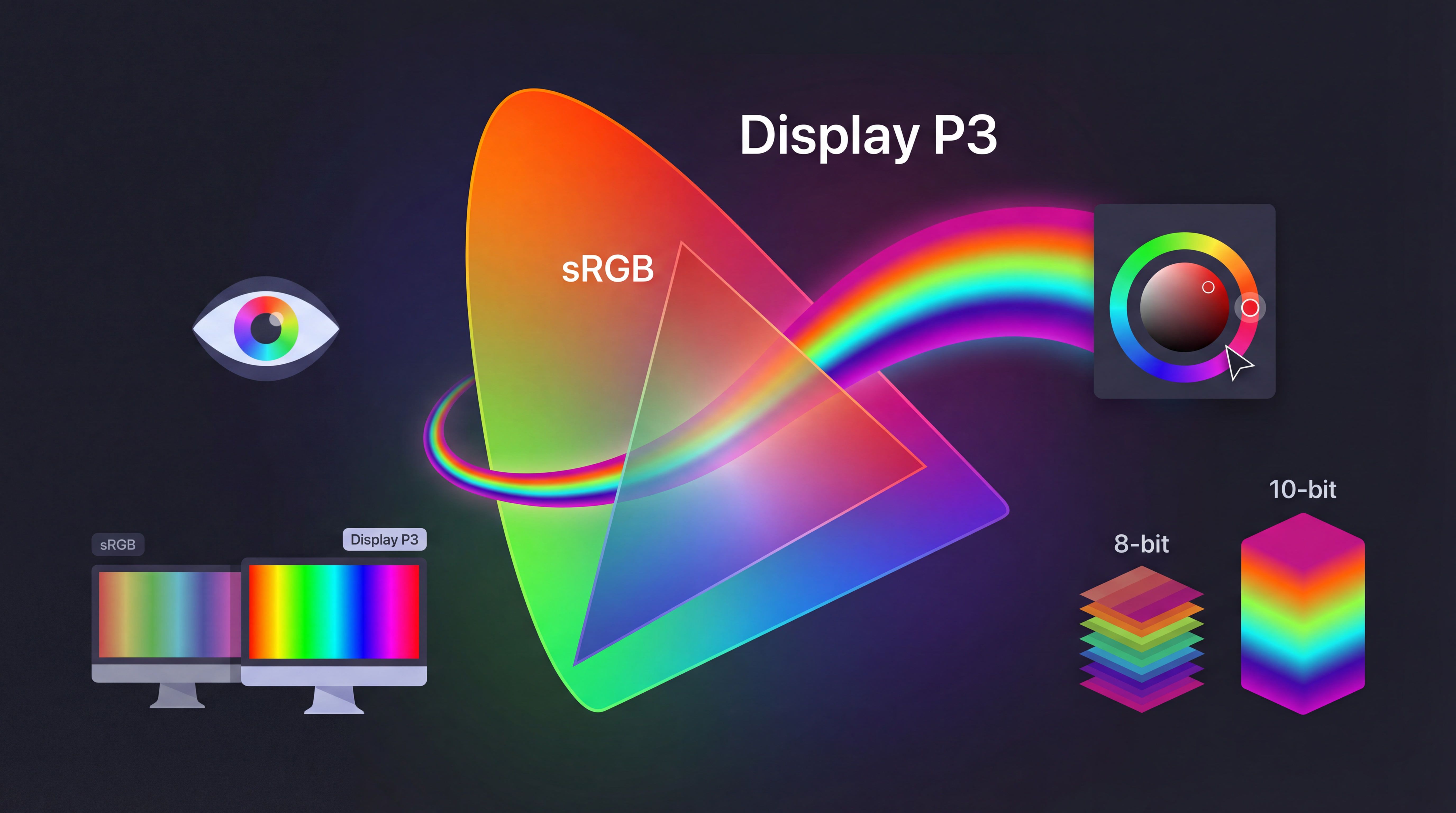
Color Spaces: sRGB vs Display P3
Understanding color spaces for web images. When to use sRGB, Display P3, and how to handle color management for consistent display across devices.
Table of Contents
Color spaces determine which colors your images can display. Most web images use sRGB (standard range). Modern displays support Display P3 (wider range, more vivid colors). Understanding the difference prevents colors looking wrong on different screens.

What are color spaces?
A color space defines the range of colors available. Think of it as a painter’s palette - some palettes have more colors than others.
sRGB - Standard RGB, created in 1996
- Supported everywhere
- Smaller color range
- Safe default for web
Display P3 - Wide gamut, created by Apple
- 25% more colors than sRGB
- Supported on modern displays (iPhones, MacBooks, high-end monitors)
- More vivid reds, greens, blues
Adobe RGB - Professional photography standard
- Even wider than P3
- Rarely used on web (poor browser support)
- For print workflows
Why sRGB is still the default
Compatibility: Works on every device, every browser, every screen.
Consistency: Images look the same everywhere (mostly).
Simplicity: No color management complexity.
For 95% of web images, use sRGB.
When to use Display P3
Use P3 when:
- Images have vivid colors (nature, products, art)
- Target audience has modern devices
- You can provide sRGB fallback
- Color accuracy matters (product photos, design work)
Don’t use P3 when:
- Compatibility is critical
- Simple workflow needed
- Images don’t have vivid colors
How to convert to sRGB
ImageMagick:
magick input.jpg -colorspace sRGB -strip output.jpgSharp:
sharp('input.jpg')
  .toColorspace('srgb')
  .jpeg({ quality: 85 })
  .toFile('output.jpg');
Photoshop: Edit → Convert to Profile → sRGB IEC61966-2.1
How to preserve P3
When saving:
// Sharp preserves color space by default
sharp('p3-image.jpg')
  .jpeg({ quality: 85 })
  .toFile('output.jpg'); // Keeps P3 if present
When serving:
@media (color-gamut: p3) {
  .vivid-image {
    background-image: url('photo-p3.jpg');
  }
}

@media (color-gamut: srgb) {
  .vivid-image {
    background-image: url('photo-srgb.jpg');
  }
}
The @media (color-gamut) media query detects which color range the display supports.
Testing color spaces
Chrome DevTools:
- Open image in new tab
- Right-click → Inspect
- Check Console for color space info
Preview (Mac): Tools → Show Inspector → “Color space” shows sRGB or Display P3
exiftool:
exiftool image.jpg | grep "Color Space"The bottom line
Simple strategy:
- Save everything as sRGB for web
- Embed sRGB color profile or strip all profiles
- Test on multiple devices
- Only use P3 if you need vivid colors AND can handle complexity
sRGB is safe, compatible, and good enough for almost everything.
Related articles: