WebP: Google's Modern Image Format
Complete guide to WebP image format - compression efficiency, quality comparison, browser support, and implementation strategies for modern web development.
WebP is one of those formats that makes you wonder why we didn’t have it sooner. Smaller files, better quality, and it works pretty much everywhere now. If you’re still serving JPEGs and PNGs exclusively in 2025, you’re probably leaving a lot of performance (and bandwidth) on the table.
What is WebP?
WebP (pronounced “weppy” - yes, really) came out of Google back in 2010. It’s based on VP8 video codec tech, which means it’s really good at compression. You can use it for pretty much anything:
- Lossy compression for photos (like JPEG but smaller)
- Lossless compression for graphics (like PNG but smaller)
- Transparency (like PNG)
- Animation (like GIF but way more efficient)
The headline numbers are impressive: typically 25-35% smaller than JPEG for photos, and 26% smaller than PNG for lossless stuff. But numbers are boring - let’s see what this actually means.
Why should you care?
File sizes, obviously
Here’s the thing: users hate waiting for images to load. Google hates it too (and they control search rankings, so…). WebP helps with both.
Real example from a site we converted:
Original JPEG: 245 KB
Same image as WebP: 156 KB
You just saved: 89 KB (36%)
That might not sound like much for one image, but multiply it by 50 images on a page and you’re saving 4.5 MB. That’s the difference between a site that loads instantly and one where users bounce before seeing anything.
It just works (now)
Back in 2015, WebP was this cool Google thing that only worked in Chrome. Not super useful. But in 2025? It works everywhere that matters:
- Chrome and Edge (duh)
- Firefox (since 2019)
- Safari (since 2020 - they took their time)
- All modern mobile browsers
About 96% of users can see WebP. The remaining 4% are either on Internet Explorer (which Microsoft killed off) or some ancient Android browser. You should still provide fallbacks for them, but don’t let the minority hold back your site’s performance.
Is it actually better than JPEG?
Short answer: yes. Long answer: it depends, but usually yes.
For photos, WebP at quality 80 looks basically identical to JPEG at quality 90, but the file is typically 30-35% smaller. We’ve done hundreds of conversions and the quality difference is hard to spot unless you’re really pixel-peeping.
For graphics with transparency (logos, icons, UI elements), it’s even better. PNG files can get massive really quickly. WebP handles transparency while keeping file sizes way down.
See for yourself
These are actual unoptimized comparisons. Same image, different formats:
Photo: JPEG vs WebP
Both images look identical. The WebP version is literally one third the size.


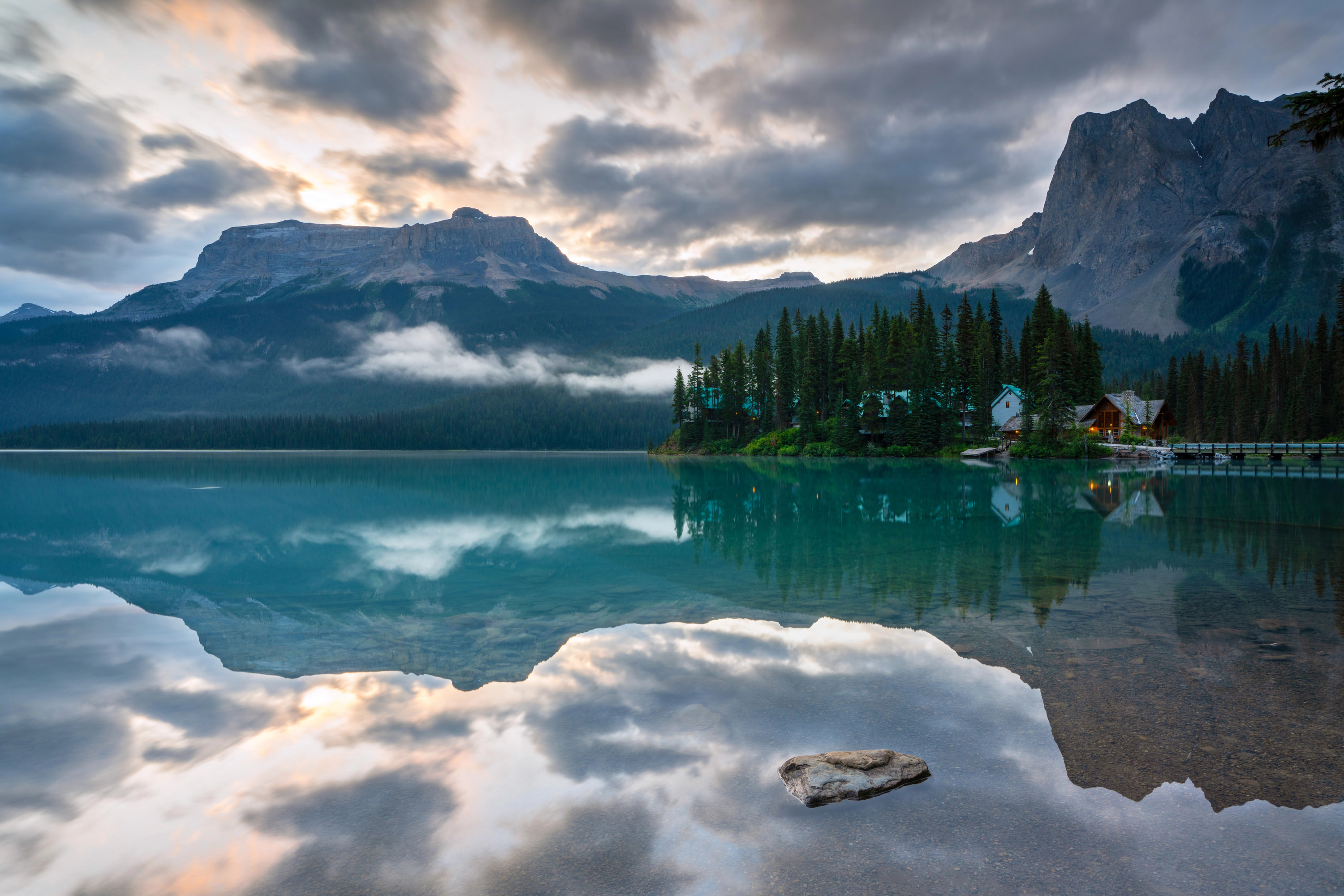
Landscape: The file size difference gets crazy with complex images
Same landscape photo. The WebP version is 1/3 the size with no visible quality loss.

PNG vs WebP (with transparency)
WebP supports transparency just like PNG, but compresses way better.


Yeah, those file size differences are real.
How to actually use it
The basics are simple - use the <picture> element:
<picture>
  <source srcset="image.webp" type="image/webp">
  <img src="image.jpg" alt="Description">
</picture>
Modern browsers will grab the WebP version. Old browsers get the JPEG. Everyone’s happy.
Responsive images (the right way)
If you want to be fancy (and you should), combine WebP with responsive images:
<picture>
  <source
    type="image/webp"
    srcset="image-400.webp 400w,
            image-800.webp 800w,
            image-1200.webp 1200w"
    sizes="(max-width: 600px) 400px,
           (max-width: 1200px) 800px,
           1200px">
  <source
    srcset="image-400.jpg 400w,
            image-800.jpg 800w,
            image-1200.jpg 1200w"
    sizes="(max-width: 600px) 400px,
           (max-width: 1200px) 800px,
           1200px">
  <img src="image-800.jpg" alt="Description">
</picture>
Yeah, it’s verbose. But it works, and modern build tools can generate this automatically.
Background images
CSS background images are a bit trickier since you can’t use <picture>. Here’s the classic approach:
.hero {
  background-image: url('hero.jpg');
}

.webp .hero {
  background-image: url('hero.webp');
}
Then detect WebP support with JavaScript:
function supportsWebP() {
  const elem = document.createElement('canvas');
  return elem.toDataURL('image/webp').indexOf('data:image/webp') === 0;
}

if (supportsWebP()) {
  document.documentElement.classList.add('webp');
}
Or just use an <img> tag and position it as a background. Sometimes the simple solution is the best.
Server-side detection
If you control the server, you can detect WebP support from the Accept header:
// Node.js/Express example
app.get('/images/:name', (req, res) => {
  const acceptsWebP = req.headers.accept?.includes('image/webp');
  const imagePath = acceptsWebP
    ? `images/${req.params.name}.webp`
    : `images/${req.params.name}.jpg`;

  res.sendFile(imagePath);
});
This is cleaner than client-side detection, but requires more server setup.
Quality settings that actually work
Converting to WebP isn’t just clicking a button - quality settings matter.
For photos:
- Quality 85-90: If file size isn’t critical and you want maximum quality
- Quality 75-80: The sweet spot for most websites (this is what we use)
- Quality 60-70: Thumbnails and image previews
- Below 60: Starting to look bad, don’t do this
For graphics/logos:
- Use lossless mode (
-losslessflag) - File size will still be smaller than PNG
- Zero quality loss
Pro tip: Always convert from the original high-quality source. Converting JPEG → WebP means you’re doing lossy compression twice, which degrades quality faster.
When NOT to use WebP
WebP is great, but it’s not perfect for everything:
Don’t use WebP for:
- Print-quality images (TIFF or high-quality JPEG are better)
- Medical/scientific imaging where exact data preservation is critical
- If you absolutely must support Internet Explorer without fallbacks (but seriously, why?)
Also worth knowing:
- WebP encoding is slower than JPEG. Don’t convert on-the-fly - pre-generate your WebP files during your build process.
- Decoding is slightly slower too, but it’s negligible on modern devices. Like, you won’t notice.
Converting images to WebP
Command line
Install the WebP tools:
brew install webp  # macOS
apt-get install webp  # Linux
Convert an image:
# Lossy conversion (for photos)
cwebp -q 80 input.jpg -o output.webp

# Lossless conversion (for graphics)
cwebp -lossless input.png -o output.webp
Online tools
If command lines aren’t your thing:
- Our converter (shameless plug, but it’s actually good)
- Squoosh.app (Google’s tool, very solid)
- CloudConvert (handles batch conversion)
Build tools
For automated conversion:
- imagemin-webp (Node.js)
- WebP Webpack Plugin
- Whatever Gulp/Grunt plugin still exists in 2025
Many CDNs also handle this automatically - Cloudflare, Cloudinary, imgix, etc.
Real-world examples
E-commerce site with tons of product images:
- Before: 50 JPEGs at 200 KB each = 10 MB per page
- After: Same images as WebP = 6.5 MB per page
- Result: 35% faster load time, happier customers
Blog with feature images:
- Before: 800 KB JPEG headers
- After: 320 KB WebP headers
- Result: First Contentful Paint improved by 1.2 seconds
Image gallery:
- Before: 100 images × 150 KB = 15 MB
- After: 100 images × 95 KB = 9.5 MB
- Result: Actually usable on mobile without burning through someone’s data plan
How to migrate (without breaking everything)
Don’t try to convert your entire site at once. Here’s how we recommend doing it:
Week 1: Test
- Convert 5-10 representative images
- Compare quality side-by-side
- Make sure they actually look good
- Test on different browsers and devices
Week 2: Implement
- Add WebP versions alongside existing images (don’t delete the originals yet)
- Update your HTML to use
<picture>elements - Deploy to staging
- Check that fallbacks work on old browsers
Week 3: Optimize
- Set up automated conversion in your build pipeline
- Add lazy loading while you’re at it
- Implement responsive image sizes
- Watch your Core Web Vitals scores improve
Week 4: Scale
- Convert the rest of your images
- Update CMS templates if you’re using one
- Keep the original files somewhere safe (you’ll want them later)
- Pat yourself on the back for making your site faster
The bottom line
WebP isn’t new or experimental anymore - it’s just how you should be serving images in 2025. The file size savings are real, the quality is excellent, and browser support is basically universal.
If you’re not using it yet, you’re literally making your users download more data for no reason. And Google’s search algorithm notices that stuff.
Want to try it out? Convert some images → and see the difference for yourself.
Related stuff worth reading:
- AVIF: The Next Generation - Even newer, even smaller (but not quite as compatible yet)
- Responsive Images Guide - How to serve the right size image to each device
- Image Optimization Checklist - Everything you need to check before shipping images
Questions? We’re a small team and actually read our emails - reach out if you need help.